Web design reflects our changing society, communications and technology, so it stands to reason that each year brings with it new trends and patterns. So which of the 2021 trends are fads, and which are likely to be around for years to come? The team at our Melbourne web design agency sat down to cover which trends to embrace and which to overlook.
Immersive web experiences: Embrace
When we see immersive web experiences in 2021, we’re talking full-height homepage hero images, smooth use of multimedia, parallax scrolling and appealing graphic data representation – all applied with thought and sensitivity to enhance storytelling. For long-form content, ‘scrollytelling’ unites smooth continuous scrolling with diverse multimedia to really engage viewers in the narrative.
Dark mode is also a popular design option being employed to create immersive experiences in 2021 (see Spotify, Twitch and Netflix) and likely to increase in popularity for some online presences, given how much time we spend looking at screens in low-light environments.
Neumorphism: Overlook
First emerging in 2020, Neumorphism takes flat icons and converts them into realistic-looking 3D objects that seem to arise from one smooth background. It sits somewhere in between Skeuomorphism, which mimics real-world elements for recognisability (such as a handset representing a phone app), and the bold two-dimensional elements of flat design. One key concern with Neumorphism is its implications for accessibility and usability; within its muted environment, clear calls to action and information hierarchy could be lost. While Neumorphism might look fantastic, we value function over form.
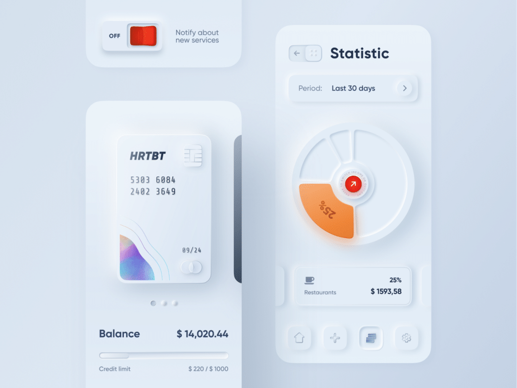
Image source: https://dribbble.com/alexplyuto
Gradient colour schemes: Embrace
Life’s made up of different shades, so why should web design be any different? Gradient colour schemes can be used to soften large areas and add visual interest to important web design elements. We’ve been using gradients in several recent projects including ThinkTV and even our own website. While flat colour schemes are also modern and highly effective, gradients are a useful element in every web designer’s toolkit.
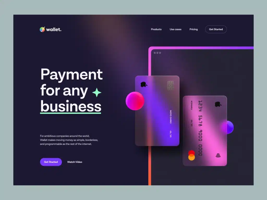
Image source: https://dribbble.com/shots/15195965-Wallet-Hero-Header-v-5
Asymmetrical layouts: Embrace
While websites are by their very nature based on grids, we’re seeing a shift away from perfectly symmetrical alignment and towards more dynamic, energetic examples of asymmetry. Of course, balance is still a design requirement for a visually pleasing website, but the occasional offsetting of an element can keep the overall effect fresh and help to highlight calls to action. While we’ll always start the design process with solid, well-structured layouts for usability, it’s great to break out of the box occasionally.
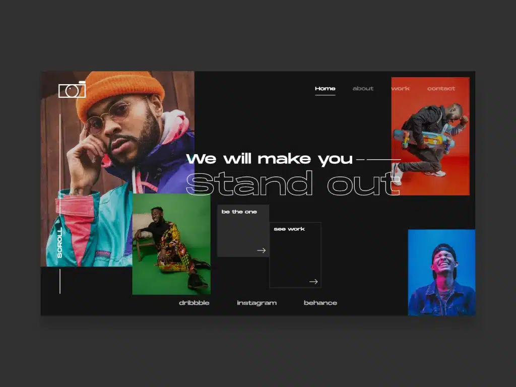
Image source: https://dribbble.com/shots/10484002-Asymmetrical-photography-hero-section
3D effects: Embrace with a sense of balance
It’s only expected that with better screen resolutions and faster internet comes a celebration of 3D elements in web design. Many websites are now welcoming viewers with realistic and highly detailed 3D animations or illustrations. The frosted glass effect is one that’s also been gaining popularity, which layers a blurred layer over an image to create a clean and modern aesthetic. 3D elements can be effective but easily overdone, so this one is a trend to embrace with a sense of balance.
https://play.hubspotvideo.com/v/4043618/id/44031290225?renderContext=onload-placeholder&parentOrigin=https%3A%2F%2Fblog.bjmdigital.com.au&pageId=44030609163&locale=en-gb#hsvid=075a5683-1e2d-4a1b-a98e-078dfdcfbe5b&t=1677449573684
Video source: https://dribbble.com/shots/11914664-Car-Commercial-Site-Scrolling
Ultra-fast website speeds: Embrace
These days competition is high, attention spans are low, and if your website takes a long time to load then you should expect that viewers will leave. Pages that load within two seconds reflect an average bounce rate of 9%, while pages that load in five seconds can have a bounce rate that bounces right up to 38%. Website speed is imperative in 2021, which is why it’s important to work with a web design agency that knows how to optimise digital assets.
Organic design: Embrace with a sense of balance
People are craving authenticity and natural connections these days, and organic design elements are seeing a resurgence as a result. This includes the tasteful use of bold and vintage typefaces, including serif options; the use of organic flowing shapes in backgrounds; and the introduction of calming and natural hues and textures. Our recent work for McKenzie’s Foods shows how elements like these can add authenticity and comfort when used with a sense of balance.
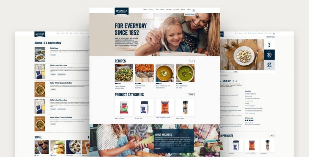
It appears that in 2021 web design is trending towards rich experiences, dynamism and authenticity with a focus on storytelling and page speed. If you’d like to read more about Neomorphism specifically, there’s an in-depth article here worth a read “The New Trend in UI Design: An Overview of Neumorphism on the Toptal website.
Or, If you’re searching for a web design agency to create a website that will be up to date without going out of date, then get in touch.
